
Why Visuals Matter More Than You Think
The beginner’s guide to avoiding visualisation traps — and how to fix them fast

Hi friend,
Welcome to The Python Football Review #012 — and to our ongoing “in plain English” series.
Today, we’re zooming in on data visualisation — what it is, why it matters, and how it fits into a typical football analytics workflow. Even though the term kind of explains itself, there's more nuance than you might think.
There’ll be no Python code in this one — just ideas, insights, and some visuals to help you build intuition.
Quick heads-up
I’m working on a Fast-Track Guide to Football Analytics with Python — designed to cut through the fluff and get you building your first football data project fast.
If templates and walkthroughs sound like your thing, join the waitlist below. It’s launching in early September.
Alright, let’s get into it.
A (good) graph is worth a thousand words?
Why do we make graphs?
Seems obvious, right? To visually represent our analysis.
But here’s the catch: in the rush to produce slick-looking visuals, we often forget the actual point of a graph — to reveal patterns and problems that numbers alone can’t show.
Allow me to introduce you to...
Anscombe’s Quartet: When Statistics Lie
In 1973, statistician Francis Anscombe made a powerful point.
He created four datasets — now known as Anscombe’s Quartet — that all had nearly identical statistical summaries: same mean, same variance, same correlation, same regression line.
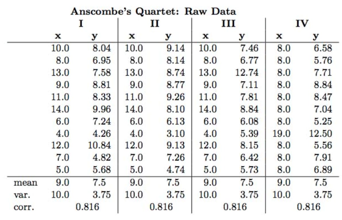
But when plotted, they looked radically different.
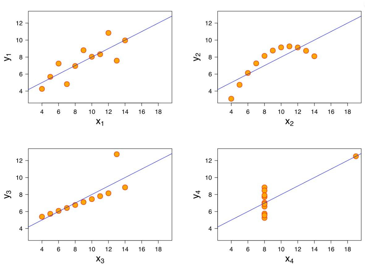
Each quadrant tells a different story:
Top Left: Linear Relationship
What you’d expect. A clean trend. Visuals and stats agree.
Top Right: Non-Linear Relationship
The correlation exists, but it’s not linear. A regression line would mislead.
Bottom Left: Outlier Distortion
One rogue point skews the analysis. You’d miss this without a plot.
Bottom Right: High-Leverage Point
A single point creates the illusion of a relationship. Remove it, and it vanishes.
Lesson: Always visualise your data. Don’t trust the stats alone.
So what is data visualisation, really?
In theory, data visualisation is the use of graphs and figures to communicate the insights hidden in your data.
In practice, it serves two different purposes (especially in a football analytics workflow):
Visuals before modeling — to explore and clean your data.
Visuals after modeling—to communicate your findings to others.
Let’s unpack both.
Data Visualisation Before Modeling
Before you train any model — or even start building one — you should always look at your data visually.
Why?
To spot outliers
To see patterns that stats might hide
To double-check missing values, or duplicates
To rethink aggregations (maybe total annual wage makes more sense than average?)
This “visual inspection” often sends you back to the wrangling phase to fix or reshape your dataset — and that’s a good thing.
Most-used graphs at this stage:
Scatter plots – Show relationships between two numeric variables
Histograms – Show the distribution of a single variable
Box plots – Highlight outliers and spread of a variable
Line plots – Track a variable over time
Bar charts – Compare categorical groups
These are your exploratory workhorses — the ones you’ll return to over and over.
The Python Toolstack? Usually just
matplotliborseaborn— one line of code gets you 80% of the way there.
Data Visualisation After Modeling
This is where data visualization becomes the final product.
You’ve done the heavy lifting. Now it’s time to show your insights — clearly and convincingly.
And football has its own set of specialized visuals for this:
Radar charts / Pizza plots – Compare player profiles across attributes
Pass maps – Show passing patterns or clusters
Pass networks – Visualize team structure and ball movement
Heat maps – Show player or team activity zones
Shot maps – Reveal shooting tendencies and goal threats
xG Flow charts – Track expected goals across match time
The Python Toolstack? Usually
matplotlibandseabornagain, combined withmplsoccer, a library tailored to football analytics.
A Few Rules of Thumb From 10 Years in Consulting
Rendering a simple figure is, in most cases, a one-liner. The real challenge is almost never the plotting itself — it’s getting your data into the right format and shape.
I told you wrangling was important (if you missed the football data wrangling issue, grab it here).
Of course, you still need to get familiar with different visualisation libraries and functions. But that’s generally the easier part.
The Real Bottlenecks
There are two major hurdles that beginners face when visualising data:
Not knowing what you want to show.
This is the hardest part. Especially early on, it's easy to feel lost — you have the data, but you don’t know what story to tell or what figure would best show it.
Here is a thought-starter:
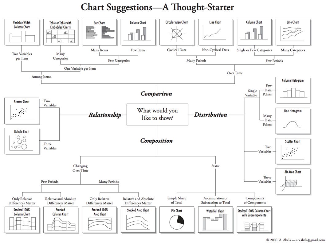
Not knowing how to wrangle the data into shape.
You might have an idea (“I want a scatter plot showing Shooting Goals Added/90 vs xG/90 per player”), but you can’t quite get the DataFrame to that point. Wrangling data is a fundamental skill that will follow you everywhere.
For beginners, the easiest way to get started is with polars — lightning fast, simpler syntax (the code reads like a recipe), and easy to revisit after a break.
If you get past these two — that is, you know what to graph and you can wrangle your way into the right shape — you’ve done 80% of the visualisation work.
The Last 20%: Branding and Beautifying
As with most things in life, going from 80% to 100% takes disproportionate effort. It’s where diminishing returns kick in. But let’s not kid ourselves — a beautiful figure often stands out because of:
Clean labels and titles
Thoughtful color palettes
Well-placed annotations
Consistent fonts and styling
Take a look at the most popular football analytics accounts on Twitter: they have a recognisable aesthetic. That’s their visual branding — a consistent combination of font choices, color themes, and annotation styles.
As a beginner though, your job is not to perfect every tiny detail. Your job is to get the fundamentals right — and trust that polish will come with time.
The good news? Once you design your own visualisation template (or adapt an existing one), you rarely need to touch it again. That’s the power of templating.
Boom — that was data visualisation fundamentals in plain English.
Data visualisation isn’t just about making pretty charts.
It’s about thinking clearly, communicating honestly, and seeing what’s really there — even when the stats try to tell a different story.
If you enjoyed this post, consider sharing it with someone who might find it useful.
If you’d like access to Python football templates, stick around — or join the waitlist for the upcoming Fast-Track Guide to Football Analytics with Python.
Either way, deep dives are coming.
Comments and shares are always appreciated.
Thanks for reading—see you next Thursday!
Martin
The Python Football Review
Solid read! Having worked professionally in statistical analysis for a while, I was thrilled to see Anscombe's Quartet invoked. For whatever it's worth, I enjoy reading your work and translating insights into my work analyzing American Football (which is a horse of an entirely different color).