
Which xG Data Should You Trust?
Opta, StatsBomb, Wyscout and Understat — the head-to-head comparison nobody shows you.

StatsBomb loves reminding us that “not all xG is created equal.”
So I decided to put that to the test.
Welcome to The Python Football Review #017 — an edition where we compare xG from four of the most widely used sources in football analytics: Opta, StatsBomb, Wyscout and Understat.
By the end of it, you’ll learn:
How closely the four providers agree on the same matches
How quickly their xG trends converge as the season unfolds
Which models consistently diverge
And how different your league table would look depending on which xG provider you trust
Let’s dive in.

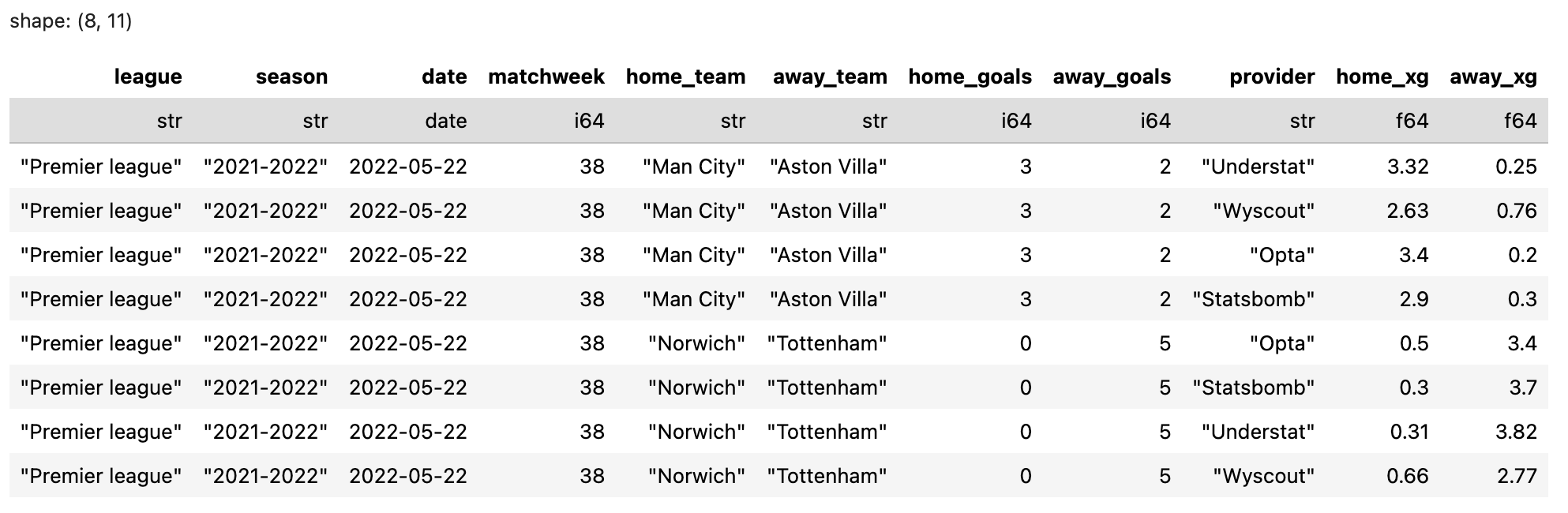
1 — The Data
For this edition, we’re working with five full seasons of matches (2017/18 to 2021/22) across the Premier League, Bundesliga, Serie A, La Liga and Ligue 1.
For every game, the dataset includes the full-time xG scoreline from four sources: Opta, StatsBomb, Wyscout and Understat. Here’s a quick look at the structure of the dataset:
Two quick disclaimers before we go further:
For obvious reasons, I can’t share the full dataset — which also makes sharing the Python code somewhat pointless, since you wouldn’t be able to reproduce the tables without the underlying data. (So no Python template for this edition.)
The four sources were extracted at different points in time: StatsBomb → May 2022, Wyscout → October 2022, Opta → May 2023, Understat → November 2025. I mention this because some providers occasionally retro-update past xG values (more on that in the end). If any discrepancies show up, timing could be part of the explanation.
How complete is the dataset?
Across the five leagues and five seasons, we’re very close to full coverage. A handful of matches are missing because at least one provider had no xG values for that game. The 2019/20 Ligue 1 season was interrupted due to Covid, hence the 279 games.
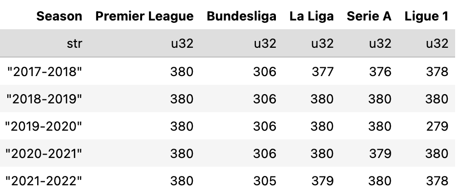
Overall, it’s a very healthy sample.
Basic descriptive statistics
Before diving deeper, let’s look at some classic descriptive stats — the mean, median, standard deviation and maximum xG values across all teams, all games and all providers.
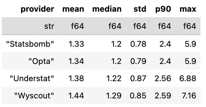
A few quick observations:
StatsBomb and Opta are similar across every summary metric.
Understat runs slightly higher on average (mean team xG = 1.38) and just about the same median-wise (1.22).
Wyscout is the most generous model in this sample — highest mean (1.44), highest variance and the highest maximum single-team xG per match.
But this is just basic summary stuff. Let’s now look at the full distributions.
2 — Comparing xG distributions across providers
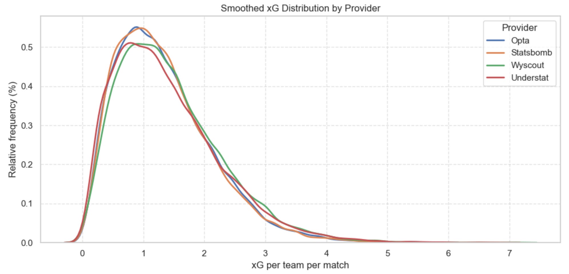
How to read this figure
This is a smoothed distribution (a KDE curve) of all xG values assigned per team per match. It shows how often each xG level occurs across thousands of matches.
The x-axis is the xG a team had in a match (0 → 7). The y-axis is a relative frequency: higher peaks mean “this xG value happens more often.”
Where the curves sit higher, that provider gives those xG values more frequently.
Where the curves tail off more slowly, that provider gives more high-xG games.
The exact height doesn’t matter — it’s the shape and position of each curve relative to the others.
What we learn from it
Opta and StatsBomb are nearly identical. Their curves overlap almost perfectly, which tells us the two models likely behave very similarly on a match-by-match basis.
Understat runs a bit higher at the very low end (below ~0.4 xG) and again at the higher end (above ~2.3 xG), while sitting slightly lower in the middle. A subtle but noticeable difference.
Wyscout assigns the lowest xG values up to around 1.5, and then consistently shifts furthest to the right with the heaviest tail. In other words, Wyscout hands out higher xG more often and produces the most extreme single-match xG values.
Match-level agreement between providers
To complement the distribution plots, here’s a simple correlation matrix comparing each provider’s match-level xG values. Each number is a Pearson correlation: 1.00 means identical behaviour, lower values mean more disagreement.
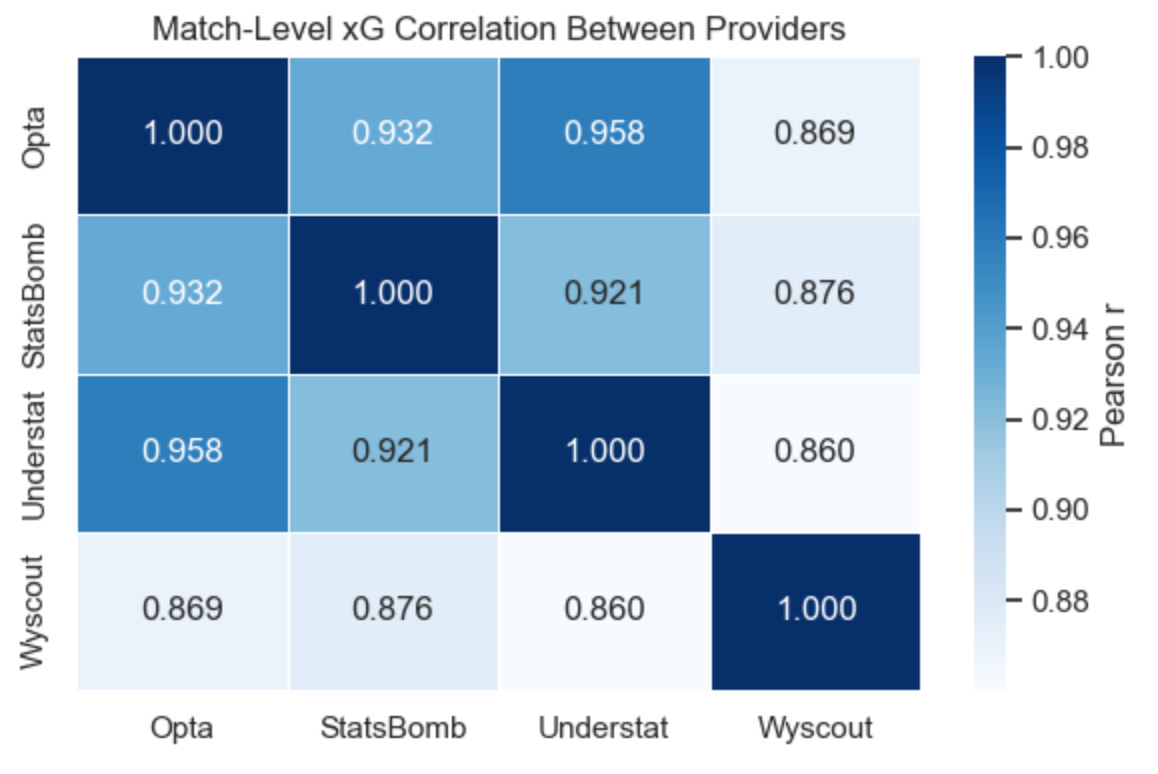
What this tells us:
Opta × Understat show the strongest alignment at match level (0.96).
Opta × StatsBomb and StatsBomb × Understat are also very tight (≈0.92–0.93).
Wyscout is an outlier — its match-level xG correlates the least with everybody else (0.86–0.88 range).
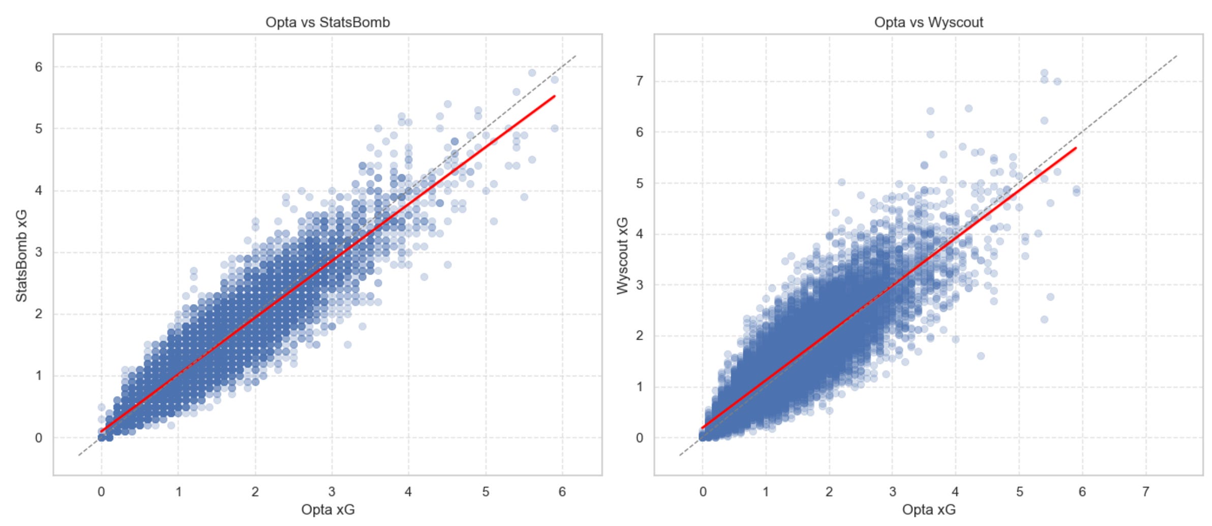
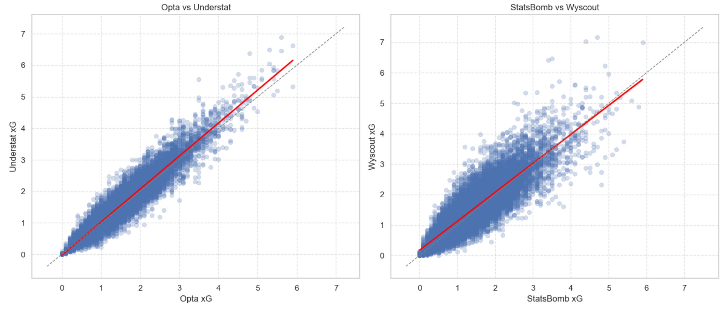
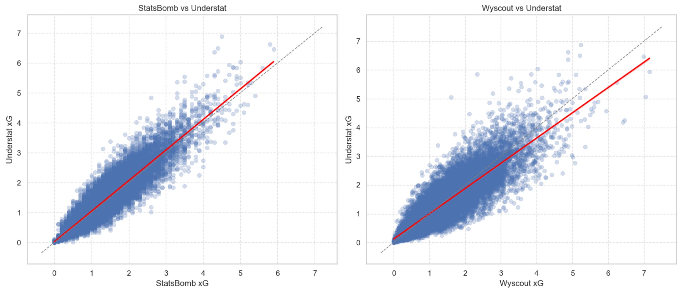
Here are a few scatterplot (with linear fits on top) before we zoom out ask a bigger question: How quickly do these (small?) differences disappear once we look at season-long trends instead of single matches?
3 — How quickly do providers agree as the season unfolds?
So far, we’ve looked at individual xG values. But single matches only get you so far.
To really understand how similar the providers are, we need to zoom out and look at what happens as the season progresses. Instead of comparing isolated xG values, we compare each team’s cumulative xG difference — the running total of xG for minus xG against — and check how closely the providers track each other over time.
In other words: As teams pile up more matches, how quickly do the providers’ season-long xG trends start agreeing with one another?
That’s exactly what the chart below shows.
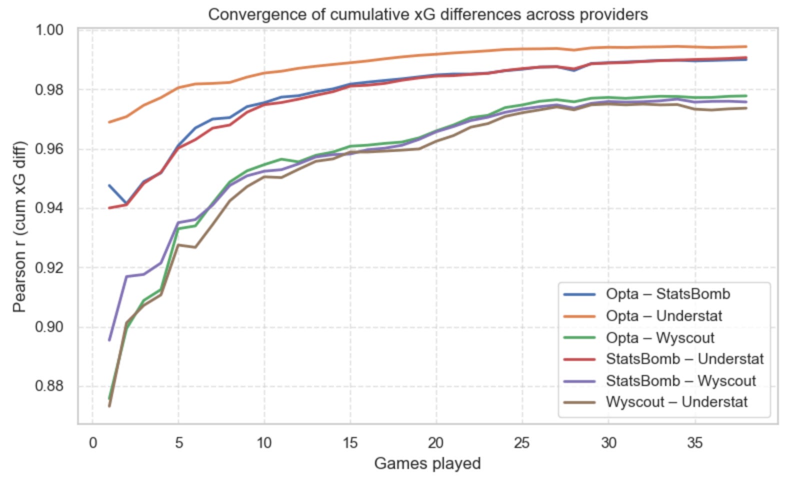
What you’re looking at
Each line shows (once more) the Pearson correlation (the one you first learned at school) between two providers’ cumulative xG differences at each match week. A value of 1.0 means the two providers generate identical season-long curves. A value of 0 means the curves have nothing in common. Put simply: the higher the line, the stronger the agreement.
What we learn from this
First, notice that all provider pairs start fairly high — even the least aligned pair begins around 0.87, which is already strong.
But some pairs converge faster and more tightly than others. Three clear clusters emerge:
Opta x Understat: the fastest and strongest agreement. After just a few matches, they’re already above 0.97, and by the end of the season they’re sitting at 0.99. These two tell virtually the same season-long story.
Opta x StatsBomb and StatsBomb x Understat: the middle cluster. By the 15-game mark, both pairs push past 0.98. Consistent, tight, and very stable.
Anything involving Wyscout: the outlier. Pairs with Wyscout start lower (0.88–0.90) and take longer to catch up. Even late in the season they peak slightly below the others. Wyscout “thinks differently,” but still gets close in the long run.
By season’s end, every pair reaches very strong agreement (>0.97). That tells us that while providers may disagree on individual matches, their season-long signals eventually converge — even for Wyscout.
4 — Biggest differences
Now that we understand how the providers move together, let’s look at something a bit more fun (and perhaps more intuitive): How often do providers disagree on who “won” the xG battle in a match?
For every game, we’ll assign a winner based on which team created more xG (according to each provider). That gives us three possible scenarios:
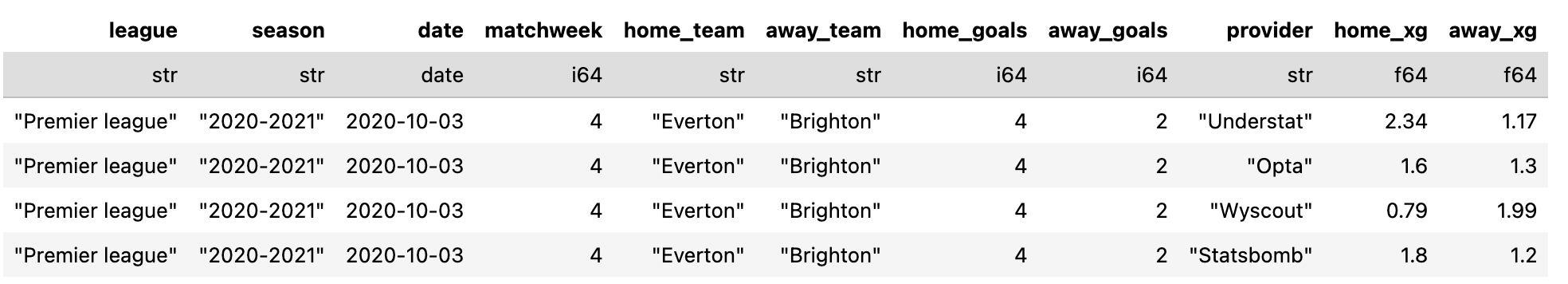
Scenario 1 — All four providers agree
Example: Tottenham vs Arsenal (20/21) — Even though Spurs won on the scoreboard, all four models agree Arsenal created the better chances. (Why this happens is a newsletter of its own…)
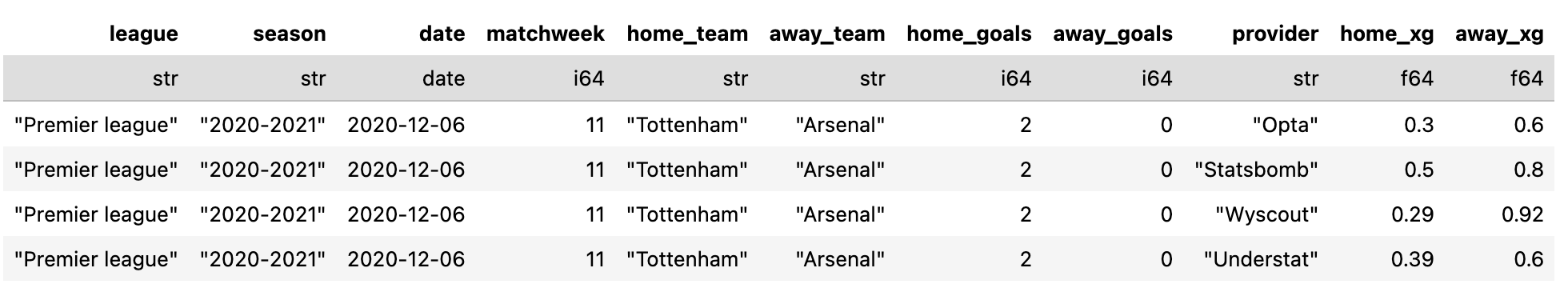
Scenario 2 — One provider disagrees
Example: Everton vs Brighton — Three models choose the same xG winner. The fourth — Wyscout in this case — goes the other way.
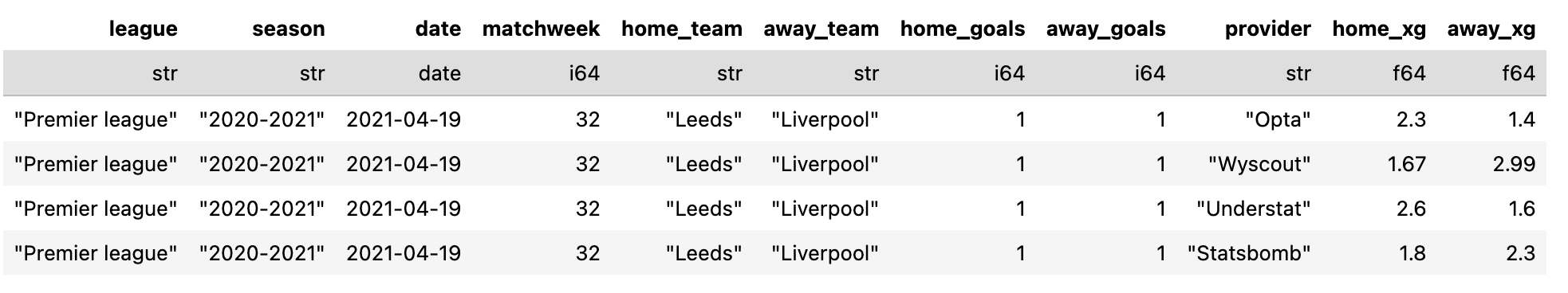
Scenario 3 — A 2-vs-2 split
Example: Liverpool vs Leeds — Opta + Understat (in this case) on one side, StatsBomb + Wyscout on the other.
How often does each scenario occur?
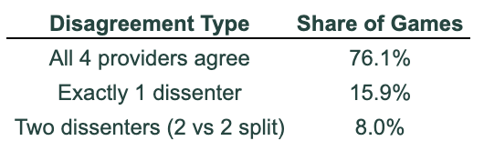
Across all five seasons and all five leagues, here’s the breakdown:
76.1% of games → all four providers agree
15.9% → exactly one provider disagrees
8.0% → a 2–2 split
I don’t know if this surprises you, but next time you’re unhappy with xGPhilosophy’s scoreline on X, remember this: in roughly 1 out of 4 games, you can turn to another provider and find a different xG storyline to defend your team’s dignity — or to complain that xG is “broken.”
(That was irony for the xG haters out there.)
Moving on…
Who is the lone dissenter?
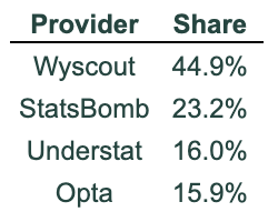
When exactly one model goes its own way, it’s overwhelmingly Wyscout with 45% of all 1-dissenter games. StatsBomb follows with 23% and then come Understat and Opta with 16%. No shock here — at this point in the newsletter, Wyscout consistently emerges as the “free spirit” of the group.
Which pairs disagree together in 2-vs-2 splits?
When we get a split vote, here’s how it breaks down:
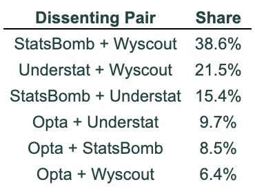
The way to read this table is simple: among all 2-vs-2 split games, 38.6% of the time it’s StatsBomb + Wyscout teaming up. In 21.5% of cases it’s Understat + Wyscout, and in 15.4% of cases it’s StatsBomb + Understat.
Once again, Wyscout is the model that most often breaks away from the others. (And I promise I’m not trying to make this newsletter about Wyscout — the numbers are doing it for me.)
5 — Who Ranks Teams the Most Differently?
Let’s now move from match-level disagreements to something even more practical: How much do the providers diverge when ranking teams over a full season?
For this section, we rank every team in every league-season based on their season-long xG difference (xG for – xG against) according to each provider. Then we look at the largest gaps between those rankings — the cases where the four models disagree the most about how good (or bad) a team really was.
Here are the 10 biggest “disagreements”:
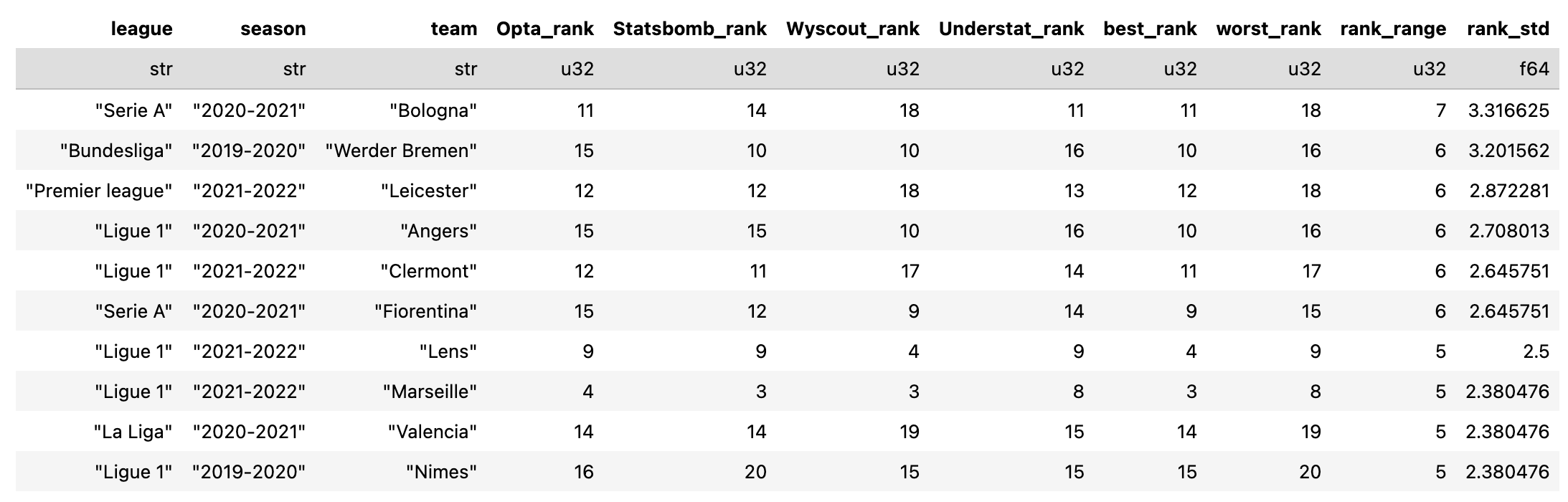
The standout case is Bologna (2020/21). Wyscout ranked them 18th, Opta and Understat both had them 11th, and StatsBomb put them 14th — a spread of 7 places, the biggest in the entire dataset.
And as you’ll see across the top 10 cases, Wyscout tends to offer either the best or the worst ranking in these big-disagreement seasons.
Even if we ignore Wyscout for a moment, there are still interesting differences. For instance:
Werder Bremen (2019/20) → StatsBomb had them 10th, Opta had them 15th
Nîmes (2019/20) → StatsBomb would have relegated them (20th), while Opta had them at 16th, safely above the drop
Now, keep in mind these are the most extreme ranking spreads. I’m not sure what I expected, but given the earlier convergence results — showing that all four models eventually align over the long run (just at different speeds) — this shouldn’t really shock us. A range of 5–6 places feels… reasonable. (Does it shock you?)
That said, the key takeaway is this: If you really want to criticise xG, here’s your ammunition: depending on the provider you choose, a team can be “relegated” or “saved.”
(That’s another joke — but the numbers do make the point.)
6 — Which model gets you closest to reality?
So far we’ve compared the providers to each other. But the really important question is: does it matter which xG source you use when you compare it to actual results?
Surprisingly… much less than you’d think.
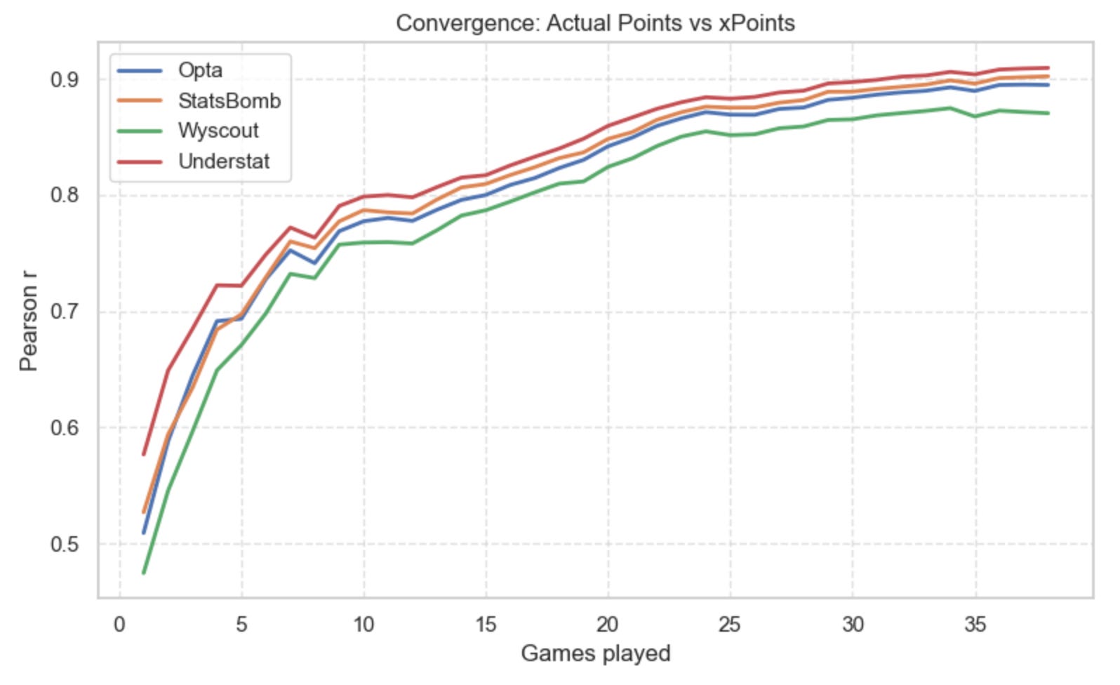
Actual Points vs Expected Points (xPoints)
The chart below shows how well each provider’s cumulative expected points (xPoints) tracks actual points won, week by week.
If you’re new to xPoints: it’s simply the probability of a team winning/drawing/losing based on its xG, typically modelled with a Poisson distribution (McKay Johns has a great beginner-friendly explanation of this here).
What the chart shows is that all four providers track reality in a similar way. One model does lag a bit behind the others (no need to name it — you already know).
Understat performs best, but the margin vs Opta/StatsBomb is small. Understat is also the first to cross 80% correlation with real points — around matchweek 10. StatsBomb follows at matchweek 14. Opta around matchweek 15. And our usual outlier joins later (matchweek 17).
This means that Understat’s xG model aligns with real results the fastest, despite being the only source here that isn’t a traditional data provider. Funny how this works.
Goal Difference vs xG Difference
This second chart compares actual goal difference with xG difference.
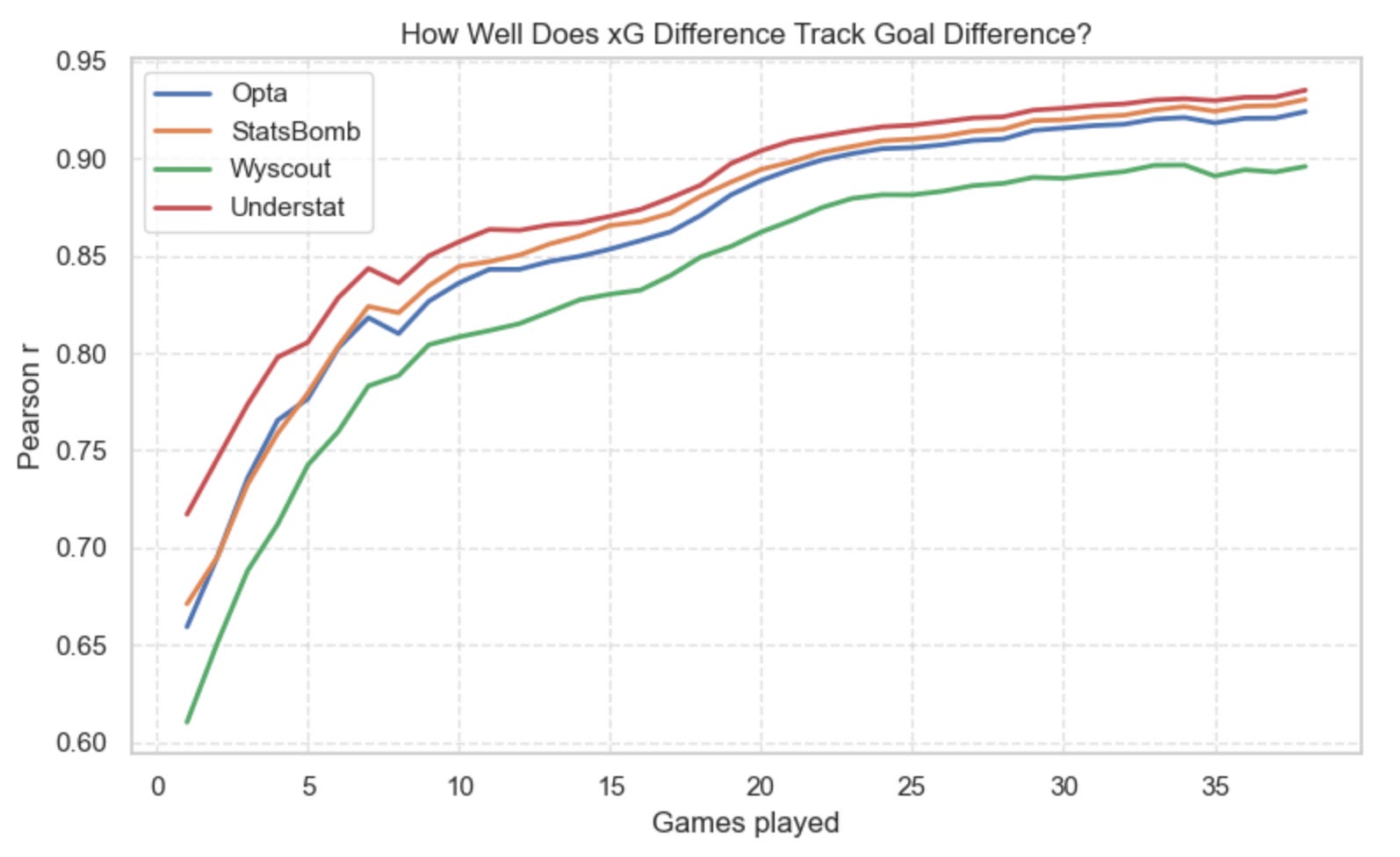
Here the story is similar — but the gaps widen slightly: Understat again leads the pack. Opta and StatsBomb stay close together. Wyscout drifts below the others more noticeably. No model collapses completely, but some definitely require more match weeks before their xGD stabilises toward reality.
League Table Positions vs xPoints Table
Finally, this third chart compares real league table positions with those created using xPoints-based rankings.
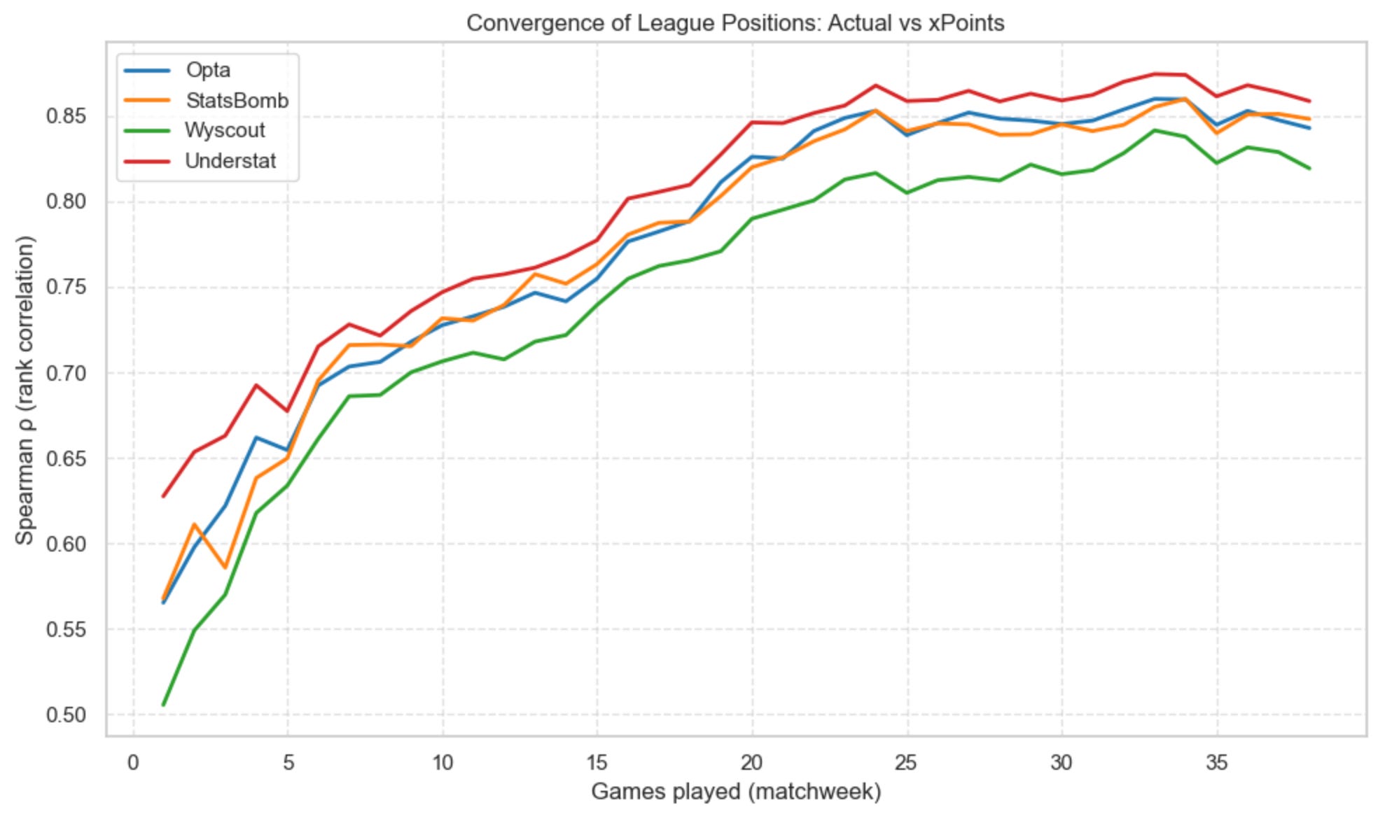
This is a stricter, more volatile test — ranking stability takes longer to emerge. Here’s when each model crosses 80% Spearman correlation with actual league tables:
Understat → matchweek 16
Opta → matchweek 19
StatsBomb → matchweek 19
Wyscout → matchweek 22
Again, the theme repeats: all four models converge, but at different speeds, and one model consistently needs a few extra weeks to fall in line.
So does xG data choice provider matters? It does …but far less than the xG evangelists (or the xG haters) would have you believe.
7 — Wrapping up
Boom — that was ‘Not All xG Is Created Equal‘ Python Football Review style.
I guess that despite StatsBomb’s claims that it is the best xG provider in the industry (notably because they consider things like shot height, nearby players, and goalkeeper position), it turns out they’re not that different from Opta after all.
And while we’re on this topic, it’s worth adding another small disclaimer. While preparing this newsletter, I was genuinely baffled by how close Opta and StatsBomb were. All the marketing talk around StatsBomb’s superiority must have gotten into my head. So, to make sure there wasn’t an error in my data, I tried to double-check whether my StatsBomb values were accurate.
I had a hard time finding another source of StatsBomb match-level data, so I scoured the internet and eventually stumbled upon a YouTube video dating back to April 2020 reviewing Statsbomb data (which at the time was hosted on Fbref) for Dortmund’s 2019/20 season.
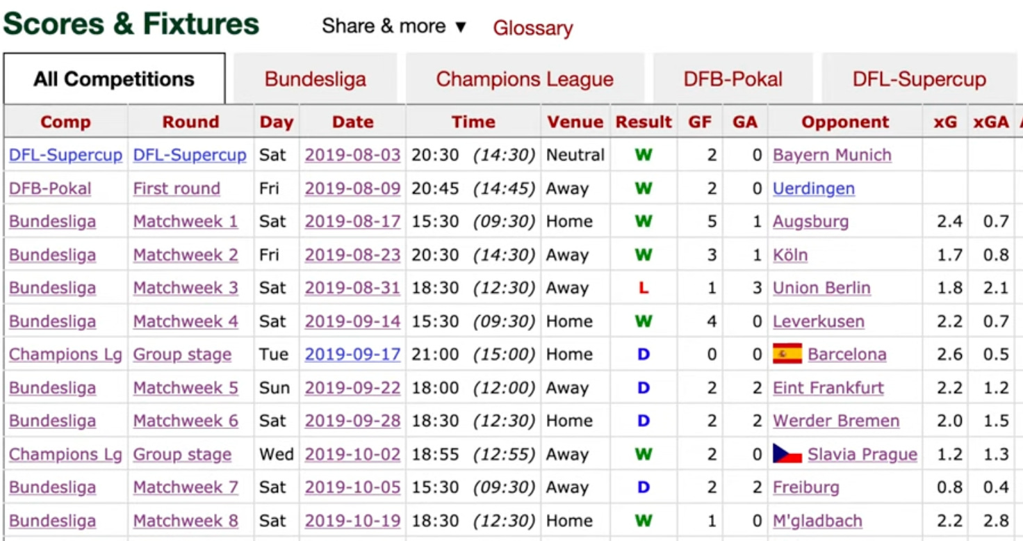
Comparing those numbers to mine revealed some differences:
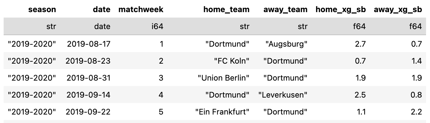
Match 1 (vs Augsburg):
My data → 2.7 vs 0.7
Statsbomb (as of 2020) → 2.4 vs 0.7
Match 2 (vs Köln):
My data → 1.4 vs 0.7
Statsbomb (as of 2020) → 1.7 vs 0.8
Match 3 (vs Union Berlin):
My data → 1.9 vs 1.9
Statsbomb (as of 2020) → 1.8 vs 2.1
This makes me think that StatsBomb retro-updated their xG model (all providers revise historic values occasionally), which means that my data captured an earlier version of their feed.
Having said that … here are a few personal takeaways:
1. I was surprised by how close Opta and Understat are
Understat isn’t really a “provider” in the formal sense, and I still have no idea where they source their raw data. So either they rely on Opta (somewhat), or they built a very similar model — which seems like the more plausible explanation. Either way, Understat remains a great free resource that’s reliable enough for most purposes.
2. Wyscout’s reliability (or lack thereof)
Wyscout never had a reputation for best data in the industry. Still, I always interpreted that to mean they might struggle with less popular leagues — lower coverage, lower interest, fewer people checking and validating data, etc.
What surprised me, though, is how differently they behave in the five biggest and most well-covered leagues. I expected their model to track much more closely with Opta and StatsBomb.
As we saw in the cumulative plots, they eventually converge — but along the way they produce more outliers than the others. If you’re using this for predictive modelling, that variance could change a few odds that your model produces.
3. xG models converge over the season — but match-to-match variance can be big
Over the long run, the models tell almost the same story. But game-by-game? In 25% of matches, at least one provider disagrees with the others about who “won” the xG battle (based on my simple xG-winner classification). This looks like a big diasgreement to me.
4. Understat data correlates best with actual team performance
I was genuinely surprised to find that Understat consistently leads the pack when it comes to convergence to actual team performance — whether you look at points, rankings, or xG differences. It’s almost ironic: the only source in the comparison that isn’t a formal data provider ends up aligning with reality the fastest.
What was your biggest takeaway?
I’d genuinely love to hear it.
The natural follow-up is obvious: shot-by-shot analysis. Instead of comparing match-level aggregates, compare each provider’s probability for each individual shot. If that’s something you’d like to see in a future edition, drop a comment — I’d be happy to expand this series.
Thank you for reading until the end.
See you next week,
Martin
First of all, I really like your work. Second, I was wondering why there was no shot-level xG comparison. I expect there would be more insights as we may expect the discrepancy in numbers of shots amongst providers, and the discrepancy between the given full-game xGs and the cumulated individual xGs.
By analysing them, we may (somehow) decypher the providers' models, like whether they considered this action a pass or a shot, and if they used MCMC, etc.
This is excellent Martin! Thank you for the detailed write up.